4 October 2026 · 6 min read
Match-3 Game Art: 7 Rules for Readable Mobile Assets
In match-3 and casual games, players make decisions in a fraction of a second on a small screen. Art that looks great in a portfolio can still fail if it does not read instantly at 64 pixels.
1. Silhouette first
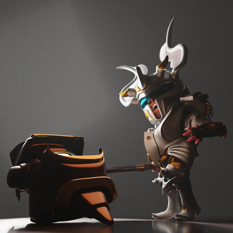
Every tile, booster and prop should be recognizable as a flat black shape. Exaggerate the features that define the object: a hammer is mostly head, a bomb is mostly round body and fuse.
2. One dominant color per piece
Players match by color before shape. Give each piece type one clear hue, keep saturation high and avoid two pieces sharing similar values.
3. Value contrast beats detail
Small details disappear on phones; light and dark shapes do not. Check your assets in grayscale at the final in-game size.
4. Soft, consistent lighting
Use one lighting setup for the whole set, typically a soft key light from the top-left with a gentle rim. Consistent lighting is what makes hundreds of assets look like one game.
5. Chunky, toy-like proportions
Thicker edges, rounded bevels and slightly inflated volumes read better and feel more satisfying to tap. Our match-3 and casual game art follow this approach.
6. Design for every size you ship
The same asset may appear as a tile, a reward pop-up and a store banner. Model once, then render and check each size; sometimes the icon version needs a simpler texture.
7. Lock the style with a sheet
After the first approved assets, create a style sheet: palette, lighting, camera angle, outline rules and material presets. It keeps quality stable as new content ships every update.
Need match-3 art?
We produce boosters, tiles, vehicles, props and meta-game decorations for casual games. See our match-3 game art service.